Showing posts with label WPF. Show all posts

Saturday, December 4, 2010

WPF Sample Series – Using WPF Binding StringFormat Property with Nullable Types

One of the great features introduced in .NET 3.5 Framework Service Pack 1 is the BindingBase StringFormat property.  When used in a data binding expression the StringFormat property replaces most IValuteConverters that were used for formatting of values in  WPF 3.0 & WPF 3.5 applications.
Here are two examples of the StringFormat property in action formatting a currency field:
<TextBox Text="{Binding Path=Salary, StringFormat=c}" />

<TextBox Text="{Binding Path=Salary, StringFormat=\{0:c\}}" />

Nullable Type in the Mix

If you are binding to a non-Nullable data type the above will work just fine.
However, if you are binding to a Nullable data type the above will not work.
This breaks down when a UI Control like a TextBox as a value and the user clears the TextBox and press TAB.  The default implementation of StringFormat will attempt to set the Target Property to an empty string which in the the case of a Nullable Decimal property will cause the following or similar data binding exception.  The below data binding exception can be viewed in the Visual Studio Output window.
Exception
 
System.Windows.Data Error: 7 : ConvertBack cannot convert value ” (type ‘String’). BindingExpression:Path=Age; DataItem=’Customer’ (HashCode=31884011); target element is ‘TextBox’ (Name=”); target property is ‘Text’ (type ‘String’) FormatException:’System.FormatException: Input string was not in a correct format.
at System.Number.StringToNumber(String str, NumberStyles options, NumberBuffer& number, NumberFormatInfo info, Boolean parseDecimal)
at System.Number.ParseInt32(String s, NumberStyles style, NumberFormatInfo info)
at System.String.System.IConvertible.ToInt32(IFormatProvider provider)
at System.Convert.ChangeType(Object value, Type conversionType, IFormatProvider provider)
at MS.Internal.Data.SystemConvertConverter.ConvertBack(Object o, Type type, Object parameter, CultureInfo culture)
at System.Windows.Data.BindingExpression.ConvertBackHelper(IValueConverter converter, Object value, Type sourceType, Object parameter, CultureInfo culture)’

TargetNullVaue to the Rescue

In the above example, the exception is thrown because of a type mismatch.  In WPF 3.0 and 3.5 I had a set of Nullable ValueConverters for my applications to handle this problem.
Another great feature introduced in .NET 3.5 Framework Service Pack 1 is the BindingBase TargetNullValue property.  This property can be used to handled the type mismatch problem when converting an empty string from a TextBox to Nothing (null) when the binding pipeline sets the target Nullable property.
Let’s have a look at the two below TextBoxes.
<TextBox
    Grid.Column="1"
    Grid.Row="1"
    Margin="0,11,11,11"
    VerticalAlignment="Top"
    Text="{Binding Path=NumberOfComputers,
            TargetNullValue={x:Static sys:String.Empty},
            StringFormat=\{0:D\}}" />

<TextBox
    Grid.Column="1"
    Grid.Row="2"
    Margin="0,11,11,11"
    VerticalAlignment="Top"
    Text="{Binding Path=Age, StringFormat=\{0:D\}}" />
These TextBoxes are both bound to Nullable properties.  The first TextBox takes advantage of the TargetNullValue property and works as expected.  The second does not.   The data binding pipeline will throw an exception when the second TextBox is changed to an empty string and it attempts to assign the value of String.Empty to the Target property.
Here is a potential problem.  If the exception gets thrown and swallowed because the code didn’t check for this, the user thinks they cleared a value but the property the TextBox is bound to never gets changed due to the exception being thrown.
Monday, April 12, 2010

What's New in Windows Presentation Foundation Version 3.5


This topic briefly discusses the major differences between Windows Presentation Foundation (WPF) versions 3.0 and 3.5.


This topic contains the following sections.

Compatibility with Version 3.0
Applications
Graphics
3-D Graphics
Data Binding
Controls
Documents
Annotations
Related Topics
  Compatibility with Version 3.0
Forward and Backward Compatibility
An application built with WPF 3.0 will run on the WPF 3.5 runtime.

An application built with WPF 3.5 will execute on the 3.0 runtime if the application only uses features that are available in WPF 3.0.

WPF 3.5 defines a new XML namespace, http://schemas.microsoft.com/netfx/2007/xaml/presentation. When building an application using WPF 3.5, you can use this namespace or the namespace defined in WPF 3.0.

Targeting a Specific Runtime
Applications built with WPF 3.0 can target any version of the framework greater or equal to the version the application was originally built against. For more information, see How to: Use an Application Configuration File to Target a .NET Framework Version.

  Applications
The following improvements have been made to the application model:

Comprehensive add-in support for supporting nonvisual and visual add-ins from standalone applications and XAML browser applications (XBAPs).

XBAPs can now run in Firefox.

Cookies can be shared between XBAPs and Web applications from the same site of origin.

Improved XAML IntelliSense experience for higher productivity.

Expanded localization support.

Visual and Nonvisual Add-Ins in WPF
An extensible application exposes functionality in a way that allows other applications to integrate with and extend its functionality. Add-ins are one common way for applications to expose their extensibility. In the .NET Framework, an add-in is typically an assembly that is packaged as a dynamic link library (.dll). The add-in is dynamically loaded by a host application at run time to use and extend services exposed by the host. The host and the add-in interact with each other through a well-known contract, which typically is a common interface that is published by the host application.

Once an application supports add-ins, first-party and third-party developers can create add-ins for it. There are many examples of these types of applications, including Office, Visual Studio, and Microsoft Windows Media Player. For example, the add-in support for Microsoft Windows Media Player allows third parties to create DVD decoders and MP3 encoders.

The .NET Framework implements the building blocks for allowing applications to support add-ins. However, the time and complexity that is required to build that support can be expensive, considering that a robust add-in design needs to handle the following:

Discovery: Finding add-ins that adhere to contracts supported by host applications.

Activation: Loading, running, and establishing communication with add-ins.

Isolation: Using either application domains or processes to establish isolation boundaries that protect applications from potential security and execution problems with add-ins.

Communication: Allowing add-ins and host applications to communicate with each other across isolation boundaries by calling methods and passing data.

Lifetime Management: Loading and unloading application domains and processes in a clean, predictable manner (see Application Domains Overview).

Versioning: Ensuring that host applications and add-ins can still communicate when new versions of either are created.

Rather than requiring you to solve these problems, .NET Framework now includes a set of types, located in the System.AddIn namespace, that are collectively known as the "add-in model". The .NET Framework add-in model provides functionality for each of the common add-in behaviors listed above.

In some scenarios, though, it may also be desirable to allow add-ins to integrate with and extend host application UIs. WPF extends the .NET Framework add-in model to enable this support, which is built around displaying a FrameworkElement owned by an add-in in the UIs of a host application. This enables WPF developers to create applications to support the following common scenarios:

Messenger-style application that provide additional services with 3rd party 'buddy" add-ins.

Gaming applications designed to host third-party party games.

Content Reader applications that host advertisements.

Mashup applications that host arbitrary modules; for example, Windows Sidebar.

And, WPF add-ins can be hosted by both standalone applications and XBAPs.

For more information, see Windows Presentation Foundation Add-Ins Overview.

Firefox Support for XBAPs
A plug-in for WPF 3.5 enables XBAPs to be run from Firefox 2.0, a feature that is not available from WPF 3.0. Key features include the following:

If Firefox 2.0 is your default browser, XBAPs honor the configuration. That is, Internet Explorer is not used for XBAPs if Firefox 2.0 is the default.

The same security features available to XBAPs running Internet Explorer are available to XBAPs running in Firefox 2.0, including partial-trust security sandboxing. Additional browser-provided security features are browser-specific.

Wednesday, March 24, 2010

WPF - Overwrite the Main method

Sometimes we need larger control over our program. In WPF the framework hide the Main method from us (altough it can be found in the obj/debug(or release) directory in the App.g.cs file). Fortunately it's possible to overwrite this method:

Step 1: open the Visual Studio with the WPF project

Step 2: in Solution Explorer right click on the App.xaml select Properties and set the Build Action to Page (so we can define resources here, as normal)

Step3: add a new class file to the project:
public class MyApplication
{
    [STAThread]
    static public void Main(string[] args)
    {
        App app = new App(); //this is the default classname and not our application's
 name
        app.InitializeComponent();
        app.Run();
    }
}

WPF Combobox Databind to a Dataset

Often there is a question on "how to bind ComboBox to a Dataset?". A short and simple answer, You cannot. The more specific answer is, you bind to a DataTable and not a DataSet.

There are two ways to accomplish this,
1. Setting the Path of the ItemsSource in XAML and then setting the DataSet as the DataContext.
XAML,
< ComboBox 
    x:Name="myComboBox"
    ItemsSource="{Binding Path=yourTableName}">               
</ComboBox>

Code behind,
DataSet ds; //ASSUMPTION: This DataSet contains a Table named yourTableName
myComboBox.DataContext = ds;


2. Setting the ItemsSource of the ComboBox to the DataTable from the DataSet.
XAML,
< ComboBox 
    x:Name="myComboBox">                
</ComboBox>

Code behind,
DataSet ds; //ASSUMPTION: This DataSet contains a Table named yourTableName
myComboBox.ItemsSource = ds["yourTableName"];

Background Image of Window or Page in WPF

For Window

< Window x:Class="MyXbap.Window1"
    xmlns="http://schemas.microsoft.com/winfx/2006/xaml/presentation"
    xmlns:x="http://schemas.microsoft.com/winfx/2006/xaml"
    Title="Window1" Height="300" Width="300" >
< !-- define Background Property -- >
    < Window.Background >
< !-- Define Image Bruch and Set Image Source to Image Path-- >
     < ImageBrush ImageSource="Beach.jpg" >< /ImageBrush >
    < /Window.Background >
< /Window >


For Page


< Page x:Class="MyXbap.Page2"
    xmlns="http://schemas.microsoft.com/winfx/2006/xaml/presentation"
    xmlns:x="http://schemas.microsoft.com/winfx/2006/xaml"
      xmlns:triple="http://thriple.codeplex.com/"
    Title="Page2"  Width="1000" Height="1000" >
< !-- define Backgroudn Property of Page- >
    < Page.Background >
< !-- define Image Brush and Set ImageSource Property -- >
        < ImageBrush ImageSource="Beach.jpg" >< /ImageBrush >
    < /Page.Background >
< /Page >

Menu Control in WPF

In this article i will be exploring the different aspects of Menu Control in WPF. I assume that the audience are familier with WPF and Declarative programming using XAML. In brief WPF is the next generation of User Interface designing. XAML helps in making clear separation between Design and code behing logic for design. Explaining about these is out of scope of this article, i go ahead with the assumption that you know basics of XAML and WPF.

Menus has been an integral part of any Windows based application. In WPF there are two classes that are used for making Menu; Menu and MenuItem. A Menu is a collection of one or more MenuItem. Each MenuItem can have a Command associated with it. A MenuItem again may further have MenuItem associated with it to make submenus. In this article i will show how to work with menus.

Lets start by looking how to create a Menu (XAML Code).
< Menu Name="Menu1"  HorizontalAlignment="Left" VerticalAlignment="Top"/ >

This tag creates a Menu Control. Now lets look at some major properties of Menu Control.
Name --> Defines the name of the menu.
Height --> Defines the Height of the menu
Width --> Defines the width of the menu
Margin --> Defines the position of the menu
Background--> Defines backcolor of the menu
HorizontalAlignment --> Defines the horizontal alignment of the menu inside the parent control.
HorizontalContentAlignment --> Defines the horizontal alignment for the menu content.
VerticalAlignment --> Defines the vertical alignment of the menu inside the parent control.
VerticalContentAlignment --> Defines the content alignment for the menu content.
ToolTip --> defines the tooltip for the menu.

Now that we have seen the major properties its time to see them in action. A Menu tag with all its properties set may look like:
< Menu Height="20" Width="200" Name="Menu1" HorizontalAlignment="Left" HorizontalContentAlignment="Left" VerticalAlignment="Top" VerticalContentAlignment="Top" Background="BlanchedAlmond">

In this sample we have set properties of the menu in XAML, but this is not the only way of doing so. Properties of a menu can be set in three different ways:
In XAML manually as done above
Using Property Window
using codebeind in C# at runtime.

Now that our menu control is ready lets add some Menu items to it.

As said earlier MenuItem tag is used to add menu item to a menu.

< MenuItem Header="_File"/>

Here we create a Menu Item with name as File.

A menu item can in turn have other menu items within it as sub menus. Now lest add some more menu items to our File menu.
< MenuItem Header="_File">
                < MenuItem Header="_New"/>
                < MenuItem Header="_Open"/>
                < Separator/>
                < MenuItem Header="_Save"/>
                < MenuItem Header="Save _All"/>
< /MenuItem>

Here we have added 4 menu items and a separator to the File Menu

A separator is used to categorize similer menu items. It is added with < Separator/> tag.

We can also add sub menu items to sub menus.

The xaml will look like
< MenuItem Header="_File">
                < MenuItem Header="_New"/>
                < MenuItem Header="_Open"/>
                < Separator/>
                < MenuItem Header="_Save">
                    < MenuItem Header="Save _File"/>
                    < MenuItem Header="Save A_ll"/>
                    < MenuItem Header="Save _As"/>
                < /MenuItem>
< /MenuItem>

Now lets add a tool tip to our menu item.

< MenuItem Header="_New">
                    < MenuItem.ToolTip>
                        < ToolTip>
                            Create new File
                        < /ToolTip>
                    < /MenuItem.ToolTip>
< /MenuItem>

Now lets look at adding and event handler to menu item.

< MenuItem Header="_New" Click="MenuItem_Click"/>

The Click event is used to associate an event handler to the menu item.

And in the code behind

private void MenuItem_Click(object sender, RoutedEventArgs e)
        {
            MessageBox.Show("Menu item Clicked");
        }

WPF Command bindings - Mouse clicks

The following article discusses the WPF command binding feature with relation to Mouse clicks.

One of WPF powerful features is the binding of commands to controls. If you have used the MVVM design pattern, you will know how useful, powerful, easy, efficient and robust the application gets with WPF commands.

A simple scenario of a command binding would be,

<Window>
<Window.CommandBindings>
    <CommandBinding Command="Help" 
       CanExecute="TestCommandCanExecute"
       Executed="TestCommandExecute" />
 </Window.CommandBindings>
<Grid>
 <Button Command="Help" Content="Click me" />
</Grid>
</Window>


When the button is clicked, first TestCommandCanExecute will be invoked and then as usual TestCommandExecute.

In addition to the simple scenarios of binding a command to a click event we also need to bind specific commands to specific events. For e.g., how about binding one command to Right Click and other to Left click ?
No problems at all. We can use the Mouse bindings to bind a specific command to a specific Mouse event.

Something like this,

<Button Content="Click Me">
    <Button.InputBindings>
        <MouseBinding Command="TestCommandLeft" MouseAction="RightClick" />
        <MouseBinding Command="TestCommandRight" MouseAction="RightClick" />
    </Button.InputBindings>
</Button>


The other Mouse actions supported for Mouse bindings are - LeftClick, RightClick, MiddleClick, WheelClick, LeftDoubleClick, RightDoubleClick, MiddleDoubleClick

I have attached an application demonstrating this behavior.

Here is the XAML,

<Window x:Class="WpfApplication1.Window1"
    xmlns="http://schemas.microsoft.com/winfx/2006/xaml/presentation"
    xmlns:x="http://schemas.microsoft.com/winfx/2006/xaml"
    xmlns:custom="clr-namespace:WpfApplication1"
    Title="Window1" Height="300" Width="300">
    
    <Window.CommandBindings>
        <CommandBinding Command="{x:Static custom:Window1.SimpleCommand}" CanExecute="SimpleCanExecute" Executed="SimpleExecute" />
        <CommandBinding Command="{x:Static custom:Window1.LeftClickCommand}" CanExecute="LeftClickCanExecute" Executed="LeftClickExecute" />
        <CommandBinding Command="{x:Static custom:Window1.RightClickCommand}" CanExecute="RightClickCanExecute" Executed="RightClickExecute" />
    </Window.CommandBindings>
    
    <StackPanel Orientation="Vertical" >
        <Button Content="Simple command" Command="{x:Static custom:Window1.SimpleCommand}">           
        </Button>
        <Button Content="Complex command">
            <Button.InputBindings>
                <MouseBinding Command="{x:Static custom:Window1.LeftClickCommand}" MouseAction="LeftClick" />
                <MouseBinding Command="{x:Static custom:Window1.RightClickCommand}" MouseAction="RightClick" />
            </Button.InputBindings>
        </Button>       
    </StackPanel>
</Window>


This is the code behind,

using System.Windows;
using System.Windows.Input;

namespace WpfApplication1
{
    /// 
    /// Interaction logic for Window1.xaml
    /// 
    public partial class Window1 : Window
    {
        public static RoutedCommand SimpleCommand = new RoutedCommand();
        public static RoutedCommand LeftClickCommand = new RoutedCommand();
        public static RoutedCommand RightClickCommand = new RoutedCommand();

        public Window1()
        {
            InitializeComponent();
        }

        private void SimpleCanExecute(object sender, CanExecuteRoutedEventArgs e)
        {
            e.CanExecute = true;
            e.Handled = true;
        }

        private void SimpleExecute(object sender, ExecutedRoutedEventArgs e)
        {
            MessageBox.Show("Simple Command");
            e.Handled = true;
        }

        private void LeftClickCanExecute(object sender, CanExecuteRoutedEventArgs e)
        {
            e.CanExecute = true;
            e.Handled = true;
        }

        private void LeftClickExecute(object sender, ExecutedRoutedEventArgs e)
        {
            MessageBox.Show("Left click");
            e.Handled = true;
        }

        private void RightClickCanExecute(object sender, CanExecuteRoutedEventArgs e)
        {
            e.CanExecute = true;
            e.Handled = true;
        }

        private void RightClickExecute(object sender, ExecutedRoutedEventArgs e)
        {
            MessageBox.Show("Right click");
            e.Handled = true;
        }
    }
}

WPF BorderBrush

This article demonstrates the way to work with WPF BorderBrush.

The Border control in WPF is used to draw a border along the edges of a control. The Border control has a property named BorderBrush which is the drawing brush for the border.

The way we declare the BorderBrush in XAML is different than through code. As we know, XAML automatically converts string to a specific type.
The following code demonstrates use of the Border element,
<StackPanel>
    <Border BorderBrush="Blue">
       <TextBox>Dummy text</TextBox> 
    </Border>    
</StackPanel>

The above code has a StackPanel containing a Border for a TextBox. The BorderBursh is assigned a Blue color. This means, the Border will be a SolidColorBrush of Blue color. SolidColorBrush is the default WPF Brush.

Now, we will see how to interact with the BorderBrush in code-behind. The scenario we will look at is, finding the current color of the BorderBrush and if Blue then changing it to Red. The following code demonstrates the same,
Color clr = (brdr.BorderBrush as SolidColorBrush).Color;
if (clr.Equals(Colors.Blue))
    brdr.BorderBrush = new SolidColorBrush(Color.Red);

WPF Menu Shortcut and Hot keys

We often use Menu items in our forms having Hot keys and shortcut keys. This is a little bit tricky to use in WPF.

In Windows forms we had an options of adding "&" before the letter we wanted to be the Hot Key. In WPF this is changed to "_".

<Menu DockPanel.Dock="Top">
    <MenuItem Header="_File">        
    </MenuItem>
</Menu>

Running this will display a "_", indicatin a hot key, for "F"

For providing shortcut keys you need to use the InputGestureText property,
<Menu DockPanel.Dock="Top">
    <MenuItem Header="_File">
        <MenuItem Header="Exit" InputGestureText="Ctrl+X">
        </MenuItem>
    </MenuItem>
</Menu>

I have added a submenu item which will be invoked using the Ctrl+X key. Just adding the InputGesture won't actually fire the menu event. We need to also handling the event. This can be done in two ways, either hook to the key strokes to see if "Ctrl+X" is pressed or bind the Command using a Command binding.
This can be done as follows,
<Window.CommandBindings> 
        <CommandBinding Command="{x:Static custom:Window1.MenuRoutedCommand}" 
                    Executed="ExecutedCustomCommand" 
                    CanExecute="CanExecuteCustomCommand" /> 
    </Window.CommandBindings> 

<Menu DockPanel.Dock="Top">
    <MenuItem Header="_File">
        <MenuItem Header="Exit" 
        Command="{x:Static custom:Window1.MenuRoutedCommand}"
        </MenuItem>
    </MenuItem>
</Menu>

code behind,

public static RoutedCommand MenuRoutedCommand = new RoutedCommand();  

public void ExecutedCustomCommand(object sender,    ExecutedRoutedEventArgs e)  
        {  
            MessageBox.Show("Executed");  
        }  
          
        public void CanExecuteCustomCommand(object sender,  
            CanExecuteRoutedEventArgs e)  
        {  
            Control target = e.Source as Control;  
 
            if (target == null)  
            {  
                e.CanExecute = false; 
                return;
            }  
            
              e.CanExecute = true;              
        }  

 public Window1()  
        {  

            InitializeComponent();  
 
           CommandBinding customBinding = new CommandBinding(  
MenuRoutedCommand, ExecutedCustomCommand, CanExecuteCustomCommand);  

            KeyGesture CloseCmdKeyGesture = new KeyGesture(  
    Key.X, ModifierKeys.Control);  
 
            CustomRoutedCommand.InputGestures.Add(CloseCmdKeyGesture);  
}

Advantages of WPF

Advantages of WPF:

1. Broad Integration: Prior to WPF, it was very difficult to use 3D, Video, Speech, and rich document viewing in addition to normal 2D Graphics and controls would have to learn several independent technologies. WPF covers all these with consisting programming model as well as tight integration when each type of media gets composited and rendered.

2. Resolution Independence: WPF applications are device independent i.e., smart client applications. Like normal applications it won’t get decrease the size as the resolution gets increase. This is possible because WPF emphasis on vector graphics.

3. Hardware Acceleration: WPF is built on top of Direct 3D, content in a WPF application whether 2D or 3D, Graphics or text is converted to 3D triangles, textures and other Direct 3D objects and then rendered by hardware. WPF applications can get the benefit of hardware acceleration for smoother graphics and all round better performance.

4. Declerative Programming: WPF takes the declarative programming to the next level with the introduction of Extensible Application Markup Language(XAML), pronounced as “Zammel”.
XAML is like HTML in web used for creating the interface, resulting graphical designers are empowered to contribute directly to the look and feel of applications.

5. Rich Composition and Customization: WPF controls are extremely compostable.
Eg: we can create combo box with animated buttons.

6. Easy Deployment: WPF build on top of ClickOnce for supporting direct integration with web browser and it’s navigation system.

Fundamentals of WPF -1

User Interface is evolved from dos based interface to windows based and now microsoft has introduced the new user interface developement methodology which is called as WPF.

Until introduction of WPF, We have application in which we primarily considered the functional aspect while the user experience takes the backseat, but now with the invention of WPF we can create rich user experience in our application. Rich user experience does not mean you load lot of bulky graphics on the user interface but it does mean that user interface you design should be user friendly so that user should be more than satisfied interacting with user interface. With the help of WPF separation of designing and developing of user interface can be easily achieved. WPF integrates application UIs, 2D graphics, 3D graphics, documents and multimedia into one single unit. Its vector based rendering engine uses hardware acceleration of modern graphic cards. This makes the UI faster, scalable and resolution independent.

There are four tools available for designer to develop the UI. These tools does have more graphics development support than Microsoft visual studio.

This tool suite is called Microsoft Expression. It consists of the four products:

Expression Blend is built to create user interfaces in WPF and Silverlight. It builds the bridge between designer and developers. VisualStudio solutions can be open from this.
Expression Design is a lightweight version of Adobe Illustrator to create and edit vector graphics.
Expression Media is built to encode, cut and enrich video files and optimize them for silverlight streaming
Expression Web is Microsoft next generation of HTML and Javascript editor.

Development method of WPF consist of following steps


1)Requirement Analysis
In this step business analyst takes the requirement and does the analysis to prepare use case and scenarios it is the iterative process between analyst and user which will clear exact need of the user.
2)Creation of prototype
From the use cases and scenarios one can develop raw prototype again this is also iterative process as designer , analyst and user is involved in this. Prototypes can be developed on paper, with MS Visio , with expression blend – sketch flow , or real application with dummy data
3)Implementation of business logic
In this step business logic implementation has been done by the developers
4)Integration
In this step integration of business logic with the user interface has been done.
5)Test
This step is a final testing phase in which testers will do testing to test all aspect of the application.

WPF separates appearance of application with its behavior. Appearance is completely defined in the XAML(Extendable markup language) and behaviors implemented using various languages like C# and visual basic. Appearance and behavior relates each other by events and command. Like HTML Graphical design tool can be managed with simple XAML instead of compiling a code. WPF controls are highly composable. It is XAML file so we can compose it easily. We can define almost any type of controls as content of another.

WPF Fundamentals

WPF Fundamentals

WPF has some important new concepts that are beyond of what most .NET developers know from WinForms. But its very useful to understand these concepts before you start developing WPF applications.
XAML

XAML stands for Extensible Application Markup Language. Its a simple language based on XML that was invented for WPF to create and initialize user interface elements. The idea is similar to HTML.


Logical and Visual Tree
User interface elements in WPF have a hierachical relation. This is called the visual tree. A user interface element is composed of multiple parts. If you build a tree including all controls parts you have the logical tree.


Layouts:-
StackPanel
The StackPanel is a simple and useful layout panel. It stacks its child elements below or beside each other, dependening on its orientation. This is very useful to create any kinds of lists. All WPF ItemsControls like ComboBox, ListBox or Menu use a StackPanel as their internal layout panel.


Code:-

How do you like your coffee?
Black
With milk
Latte machiato
Chappuchino


Stack Items horizontally
A good example for a horizontal stack panel are the "OK" and "Cancel" buttons of a dialog window. Because the size of the text can change if the user changes the font-size or switches the language we should avoid fixed sized buttons. The stack panel aligns the two buttons depending on their desired size. If they need more space they will get it automatically. Never mess again with too small or too large buttons.
Code:-


OK
Cancel

WPF Grid Layout Panel
The grid layout panel is the most powerful layout panel in WPF because its so flexible and universal in use. Thats the reason why Visual Studio adds a Grid layout control as root element by default to each Window or Page.
The grid layout defines a set of columns and rows. Each side of a control that has been added to the grid layout can now be bound to one of the row or colum with an optional margin.
Code:-


Row:0 Col:0
Row:1 Col:1
Row:2 Col:2
Row:2 Col:2


Sizing rows and columns
The size of a row or a column can be defined in the following types
• Fixed size of logical units (wpf pixels)
• Auto takes as much space as needed by contained controls
• Star (*) takes as much space as possible, percentally split over all star columns. Like percentage in a HTML table except that the sum of all relative columns does not have to be 100

WPF Timer (DispatcherTimer)

This article discusses the WPF DispatcherTimer.

Most of us are from a background of C# (or VB.Net). You must have some point of time come across a scenario for performing a repetitive GUI operation after certain period of time. The solution in most cases has been the WinForm's Timer.

What about WPF ? Does it have a Timer ?

WPF no different to WinForm has it's own Timer equivalent. It is called DispatcherTimer. There are other options to get the Timer behavior but one of the most efficient for a Window based operation is the DispatcherTimer.

I have attached a sample Timer application demonstrating the functionality.

The window has a "Start timer" and "Stop timer" functionality. There is an input TextBox which takes the Timer frequency in milliseconds.

Just enter the Timer frequency in millisecond and hit the "Start timer" button. There is a status bar which displays the status of the time. At start it will be blank. When you start the Timer it will display the current Time and when you stop the Timer it will display the "Stopped" status.

Let us discuss the code to look into how we use it.

XAML,
< Window x:Class="TimerSample.Window1"
    xmlns="http://schemas.microsoft.com/winfx/2006/xaml/presentation"
    xmlns:x="http://schemas.microsoft.com/winfx/2006/xaml"
    Title="Timer" Height="148" Width="300" ResizeMode="NoResize" 
WindowStartupLocation="CenterScreen">
    <StackPanel Orientation="Vertical">
        <StackPanel Orientation="Horizontal">
            <Label Margin="50,5,5,5">Timer value:</Label>
            <TextBox Name="time"  Height="20">1000</TextBox>
            <Label Margin="0,5,5,5" FontWeight="Bold">ms</Label>
        </StackPanel>
        <StackPanel Orientation="Horizontal">
            <Button Margin="50,5,5,5" Click="Start_Click">Start timer</Button>
            <Button Margin="5,5,75,5" Click="Stop_Click">Stop timer</Button>
        </StackPanel>
        <TextBlock Name="status"  Margin="0,35,0,0" Background="LightGray"
 Height="20" Padding="25,0,0,0">Not working</TextBlock>
    </StackPanel>
</Window>


Code behind,
public partial class Window1 : Window
{
    DispatcherTimer _timer;

    public Window1()
    {
        InitializeComponent();

        _timer = new DispatcherTimer();
        _timer.Tick += new EventHandler(delegate(object s, EventArgs a)
        {
            status.Text = "Started: " + DateTime.Now;
            //MessageBox.Show("Dummy message"); //notify timer end
            //this.Close(); //close application
        });
    }

    private void Start_Click(object sender, RoutedEventArgs e)
    {
        // Set the Interval
        _timer.Interval = TimeSpan.FromMilliseconds(Convert.ToDouble(time.Text));

        // Start the timer
        _timer.Start();

        status.Text = "Started";
    }

    private void Stop_Click(object sender, RoutedEventArgs e)
    {
        // Stop the timer
        _timer.Stop();

        status.Text = "Stopped";
    }
}


We have a local variable of type DispatcherTimer - _timer. We manipulate this variable to start and stop the timer. At start we initialize the variable with an Event delegate to fire whenever the Timer ticks.
 _timer.Tick += new EventHandler(delegate(object s, EventArgs a)
        {
            status.Text = "Started: " + DateTime.Now;
            //MessageBox.Show("Dummy message"); //notify timer end
            //this.Close(); //close application
        });


I have specifically left the commented lines to show the different possibilities that can be done in the Event delegate. Whenever the Timer ticks the event is fired and Status bar is updated with the most recent DateTime.

DispatcerTimer runs on the UI thread and hence does not need marshaling back and forth as we have to do in the normal cases of a Thread.

Basics of WPF

WPF should not be used just to be able to have stylish looking UI with zoomable multi-state 3D buttons. WPF solves one of the biggest problems with user experience - data visualization. How can an application present complex data to the user that provides a highly flexible and customizable way for the user to find the right item doing very little work (or clicks) or minimal guidance on navigation.

Some of the good examples can be seen from the following link:

http://channel9.msdn.com/Showpost.aspx?postid=109413
http://channel9.msdn.com/Showpost.aspx?postid=116327

WPF is a developer’s paradise. The platform has many features which make *programming* more enjoyable and flexible.

- The databinding in WPF is far more powerful and comprehensive than in WinForms. This reduces the amount of code you need to write, and allows you to easily bind to pretty much anything.
- Routed events change the way you work with events. Now that events route down and up the element tree, there are many more ways to design code which deals with events for many controls, or controls which are loaded dynamically.
- Attached properties let you set a property on any object, even though the object does not expose that property. The possibilities are endless!
- Triggers are an extremely useful way to express conditional logic in markup. Very convenient.
- WPF is common technology which can be used for both Web and Windows .In WPF, you can create layout (User Interface) which can be used both in Window and Web application. (i.e. Before WPF, you will have to create separate layout for windows and web.)
- There is a nice feature of WPF is XPS (XML Paper specification) which means document looks same on screen and on a printer.
- One nice feature of WPF is that there is no need to write code for GDI+ and Direct 3D objects because it has been handled by WPF.
- WCF supports internationalization.
The new features of WPF can be used in this application are as follows:
- Freezable Objects:
Freezable objects provide special features that can help improve application performance. Examples of freezable objects include brushes, pens, transformations, geometries, and animations.

http://www.codeproject.com/KB/WPF/GridLengthAnimation.aspx
http://msdn2.microsoft.com/en-us/library/ms750509.aspx

Visual tree and/or Logical tree:


XAML is natural for representing a user interface because of its hierarchical nature. In WPF, user interfaces are constructed from a tree of objects known as a logical tree.

http://msdn2.microsoft.com/en-us/library/ms753391.aspx

http://msdn2.microsoft.com/en-us/library/ms742244.aspx

http://www.codeproject.com/KB/WPF/WpfElementTrees.aspx

http://blogs.interknowlogy.com/johnbowen/archive/2007/04/01/12495.aspx

Content Model :


In WPF, different classes of elements are categorized based on the type and number of their logical children. These logical children are also referred as the "content" of the control. WPF defines several different "content models" for various different classes of elements.
The controls that can contain a single item (single logical child of type Object) are called "content controls". These controls derive from the ContentControl base class. Controls that can contain a collection of items (many logical children of type Object) are called "items controls". These controls derive from the ItemsControl base class.
There are different kinds of content models available in WPF like Controls content model, Decoder content model, Panel content model, TextBox and TextBlock content model.

http://msdn2.microsoft.com/en-us/library/ms751553.aspx

http://drwpf.com/blog/Home/tabid/36/EntryID/24/Default.aspx

Use of Data Templates:


Data templates are a natural extension of styling controls and elements provided in Windows Presentation Foundation. Just as we can apply a visual Style to a user interface (UI) element, we can apply a DataTemplate that can determine both visual aspects of how the data is presented and how data binding accesses the presented data.

By applying different data templates to the same data, one can flexibly change the visual appearance of the data in the application. Data templates can be applied to both Windows Presentation Foundation content controls (for example: Button and Hyperlink) and items controls (for example: ListBox, ComboBox, and Menu). These controls have built-in support for applying such data templates.

http://msdn2.microsoft.com/en-us/library/ms742521.aspx

http://www.longhorncorner.com/UploadFile/cook451/DataBindingXAML12102005134820PM/DataBindingXAML.aspx?ArticleID=a015a832-cbba-4e35-b287-3372a53e548e

http://www.beacosta.com/blog/?p=40

Drag and Drop:


Drag-and-drop commonly refers to a method of user interface (UI) interaction that involves using a mouse (or some other pointing device) to select one or more objects, dragging these objects over some desired drop target in the UI, and dropping them.

http://msdn2.microsoft.com/en-us/library/ms746687.aspx

http://thewpfblog.com/?p=59

Tuesday, March 9, 2010

Managing Cookies in a WPF Application

There are two types of cookies - session cookies and persistent cookies. Session cookies data is available during an application session only and once the session is expired, the cookie is deleted.
 Persistent cookies on the other hand are stored in the Temporary Internet Files folder and can be stored for longer time and the life time of these cookies are set within the cookie data as an expiration date and time.
A cookie data is in the name and value pair format where NAME=VALUE. Here is an example of a cookie data.
"UserName=hitendra"
If a cookie data has expires data followed by a semi colon in it, it is considered as a persistent cookie. Here is an example of a persistent cookie. Here is the format of a persistent cookie.
NAME=VALUE; expires=DAY, DD-MMM-YYYY HH:MM:SS GMT
Here is an example of a persistent cookie data.
"UserName=Mahesh; expires=Friday, 10-Dec-2010 00:00:00 GMT"
Application.SetCookie method creates a cookie on users' machine. This method takes two parameters -  an Uri and a string. The first parameter, the Uri specifies a location where the cookie will be created at and second parameter is a cookie data.
Code snippet in Listing 1 creates two cookies using SetCookie method. One is a session cookie and other is a persistent cookie.
string simpleCookie = "CSCUser1=Mahesh";
string cookieWithExpiration = "CSCUser2=hitendra;expires=Sat, 10-Oct-2012 00:00:00 GMT";

Uri cookieUri1 = new Uri(@"C:\Junk\SimpleMC");
Uri cookieUri2 = new Uri(@"C:\Junk\PersMC");

Application.SetCookie(cookieUri1, simpleCookie);
Application.SetCookie(cookieUri2, cookieWithExpiration);
     
Application.GetCookie method retrieves cookie data from the given Uri.
The code listed in Listing 2 uses the GetCookie method to get the cookie data and displays it in a MessageBox.
Uri cookiePath = new Uri(@"C:\Junk\MC");
string cookie = Application.GetCookie(cookiePath);
MessageBox.Show(cookie)

Show multiple Windows at startup in WPF

When you create a WPF application, your App.xaml looks like this. As you can see from this XAML code, the StartupUri is set to Window1.xaml. That means, when your application runs, Window1.xaml is the first Window that is shown.
<Application x:Class="WPFSample.App"
             xmlns="http://schemas.microsoft.com/winfx/2006/xaml/presentation"
             xmlns:x="http://schemas.microsoft.com/winfx/2006/xaml"
             StartupUri="Window1.xaml"
             >
    <Application.Resources>
        
    </Application.Resources>
</Application>
Now let's say, you have one more window called SecondWindow.xaml. You want both of these Windows to be shown when the application starts.
This can be achieved by calling SecondWindow on the application startup event. To write the startup event handler, I add Startup="App_Startup" to App.xaml.
<Application x:Class="WPFSample.App"
             xmlns="http://schemas.microsoft.com/winfx/2006/xaml/presentation"
             xmlns:x="http://schemas.microsoft.com/winfx/2006/xaml"
             StartupUri="Window1.xaml"
             Startup="App_Startup">
    <Application.Resources>
        
    </Application.Resources>
</Application>

Now I write this event handler in the App class and create an instance of SecondWindow, set its position by using Top and Left properties and call its Show method to make it visible.
  public partial class App : Application
    {
        void App_Startup(object sender, StartupEventArgs e)
        {
            SecondWindow mainWindow = new SecondWindow();
            mainWindow.Top = 100;
            mainWindow.Left = 400;
            mainWindow.Show();
        }
    }

Transparent Window in WPF Application

Introduction

I was searching for a Transparent Window style in WPF. And I found this in codeplex as FluidKit. In this article I will guide you through how to use it. Remember Transparent Windows is not available in Windows XP by default Shell, but in Windows Vista and Windows 7 the Shell supports Transparency.

Creating WPF Application

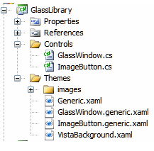
After creating the WPF User Control Library, add the Controls and Themes to the Project and remove the default UserControl.xaml and UserControl.xaml.cs files.

Your WPF User Control Library project structure would look like as follows:

image2.3.gif
Change the namespace of the application wherever required in this project.


xmlns:Controls="clr-namespace:GlassLibrary.Controls;assembly=GlassLibrary"
Change the xaml mark up as the Custom Window as follows:
<Controls:GlassWindow x:Class="GlassWindowSample.Window1"    xmlns="http://schemas.microsoft.com/winfx/2006/xaml/presentation"    xmlns:Controls="clr-namespace:GlassLibrary.Controls;assembly=GlassLibrary"    xmlns:x="http://schemas.microsoft.com/winfx/2006/xaml"    Title="Window1" Height="300" Width="300">    <Grid>
    </Grid></Controls:GlassWindow>
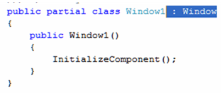
Remove the Window refernce in code behind.

image2.8.gif

That's it. Now run the application and you would see the Transparent Window. Use different controls inside the Grid to have the Application ready for you.

Wednesday, March 3, 2010

WPF Development Tools

Microsoft provides two development tools for WPF applications. One is Visual Studio, made for developers and the other is Expression Blend made for designers. While Visual Studio is good in code and XAML editing, it has a rare support for all the graphical stuff like gradients, template editing, animation, etc. This is the point where Expression Blend comes in. Blend covers the graphical part very well but it has (still) rare support for code and XAML editing.
So the conclusion is that you will need both of them.

Microsoft Visual Studio 2010

Visual Studio is the tool for developers to develop WPF applications. It includes a graphical designer for WPF since version 2008. If you're using Visual Studio 2005 you can install an add-on that enables you to develop WPF applications.
Microsoft provides a free Express Edition of Visual Studio that also includes the WPF designer. You can download it from the following URL
Download Microsoft Visual C# 2010 - Express Edition

Microsoft Expression Blend 3 + Sketch Flow

Expression Blend is the tool for designers. It's part of the Expression Studio, a new tool suite from Microsoft especially created for user experience designers. Blend covers all the missing features of the Visual Studio designer like styling, templating, animations, 3D graphics, resources and gradients.
In the latest Version it also includes a powerful prototyping tool called SketchFlow. Expression Blend can open solution files created by visual studio.
Download Microsoft Expression Blend 3